ENPT
Product Design & AI Engineering
Year
Role
Duration
Team
Tools
View Project
Founders and solo devs build products without a designer and end up with fragmented visual identity, no tokens, no system.
Product Designer & AI Engineer, solo: market research, product, design system and code, from zero to deploy.
MVP live, solo, from zero to deploy: from a seed color to exportable palette, tokens and style guide, previewed on real components.
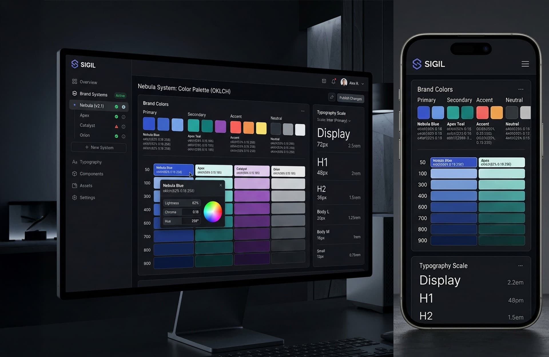
Visual system generator for founders, devs, and independent creators. Paste a seed color and Sigil generates a palette, design tokens, and style guides ready for export. Cohesive visual identity without opening Figma.
Founders, developers, and independent creators build products without a designer, and feel it in every inconsistent screen, off-pattern button, or improvised palette. Tools like Figma, Tokens Studio, and Brand.ai were built for designers. Solo builders don't have time to learn these workflows, nor the budget to outsource. The practical result: projects with fragmented visual identity, absent design tokens, and no way to scale the system without rework. The design system tooling market is large, but every solution assumes there is a designer in the loop.
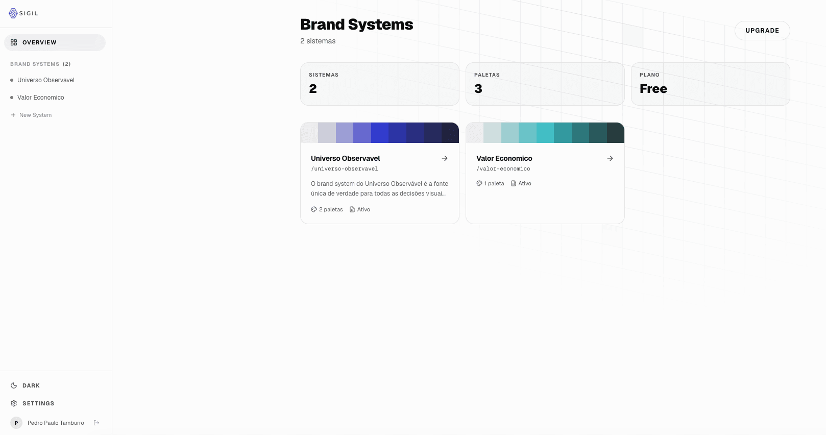
The growth of no-code tools and the indie hacker movement created a clear demand: solo builders who need visual consistency but reject complex workflows. Tokens Studio and Style Dictionary are powerful, but have steep learning curves and assume design system familiarity. Coolors and Realtime Colors solve palette, but don't connect to code. No tool closes the full cycle, from seed color to config file ready for use in the project.
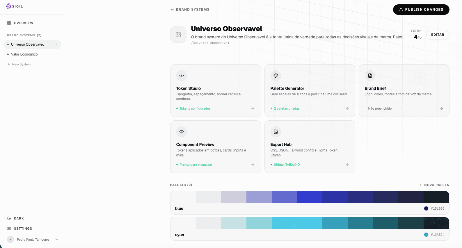
Sigil closes the loop in a three-step flow: pick a primary color, name your brand, export. Internally, the app generates a harmonic palette with light/dark modes, creates a Brand Brief with logo, colors, typography, and tone of voice, and makes all tokens available in the Export Hub in multiple formats. The Component Preview shows tokens applied to real buttons, cards, and inputs, so the user can see the system working before writing a line of code.
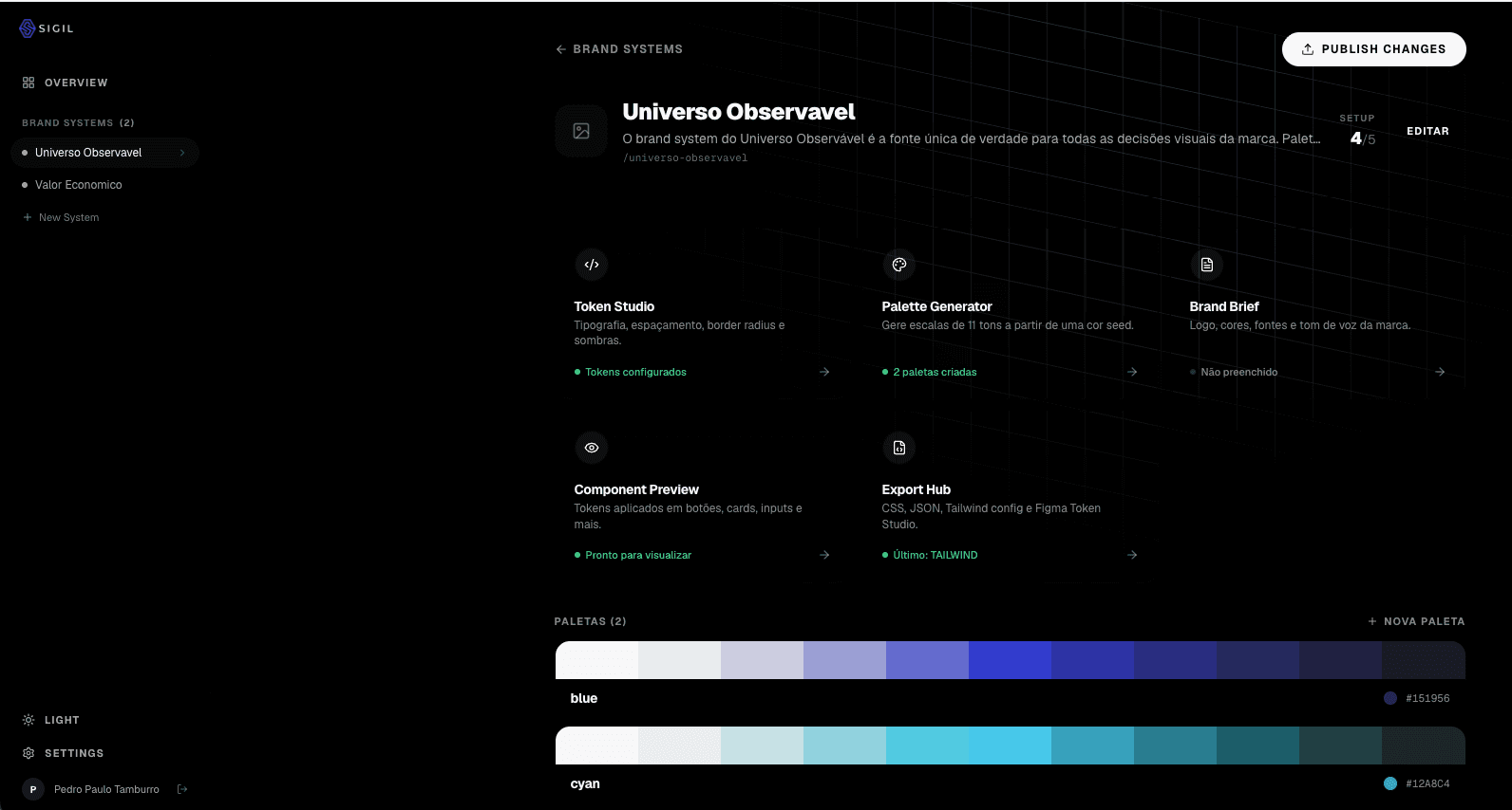
Each feature was designed to eliminate a manual step from the visual identity creation flow. Token Studio creates and exports design tokens in JSON, CSS, and Tailwind config. Palette Generator generates harmonic palettes from a seed color with automatic light/dark modes. Brand Brief is a living document with logo, colors, typography, and tone of voice. Component Preview applies tokens to real components before coding. Export Hub centralizes all export formats, such as Tailwind, CSS vars, and Figma Variables JSON, or generates a public shareable brand page.
Built entirely with AI coding (Claude as pair programmer from scaffolding to deployment). Stack: Next.js 14 (App Router), Prisma + PostgreSQL for BrandSystems, Palettes, ExportLogs, and SharedPages persistence, Claude API for token suggestions and Brand Brief generation, Vercel for continuous deployment. The freemium model limits Free to 1 brand system and 3 palettes without export, which is enough to experiment, not enough to scale. PRO (R$39/month) unlocks everything: unlimited brand systems, full Export Hub, and public SharedPages.
The key learning was about the value of closing the loop. Palette tools are a dime a dozen, but Sigil's differentiator is connecting seed color, tokens, and code export in a single flow. The decision to include Component Preview was the most important one: it was designed so users see tokens working in real components before exporting — removing the friction between generating the system and trusting it. The 14-day unlimited trial model was chosen to ensure users reach the 'aha moment', which only happens when they export and see the Tailwind config working in their own project.
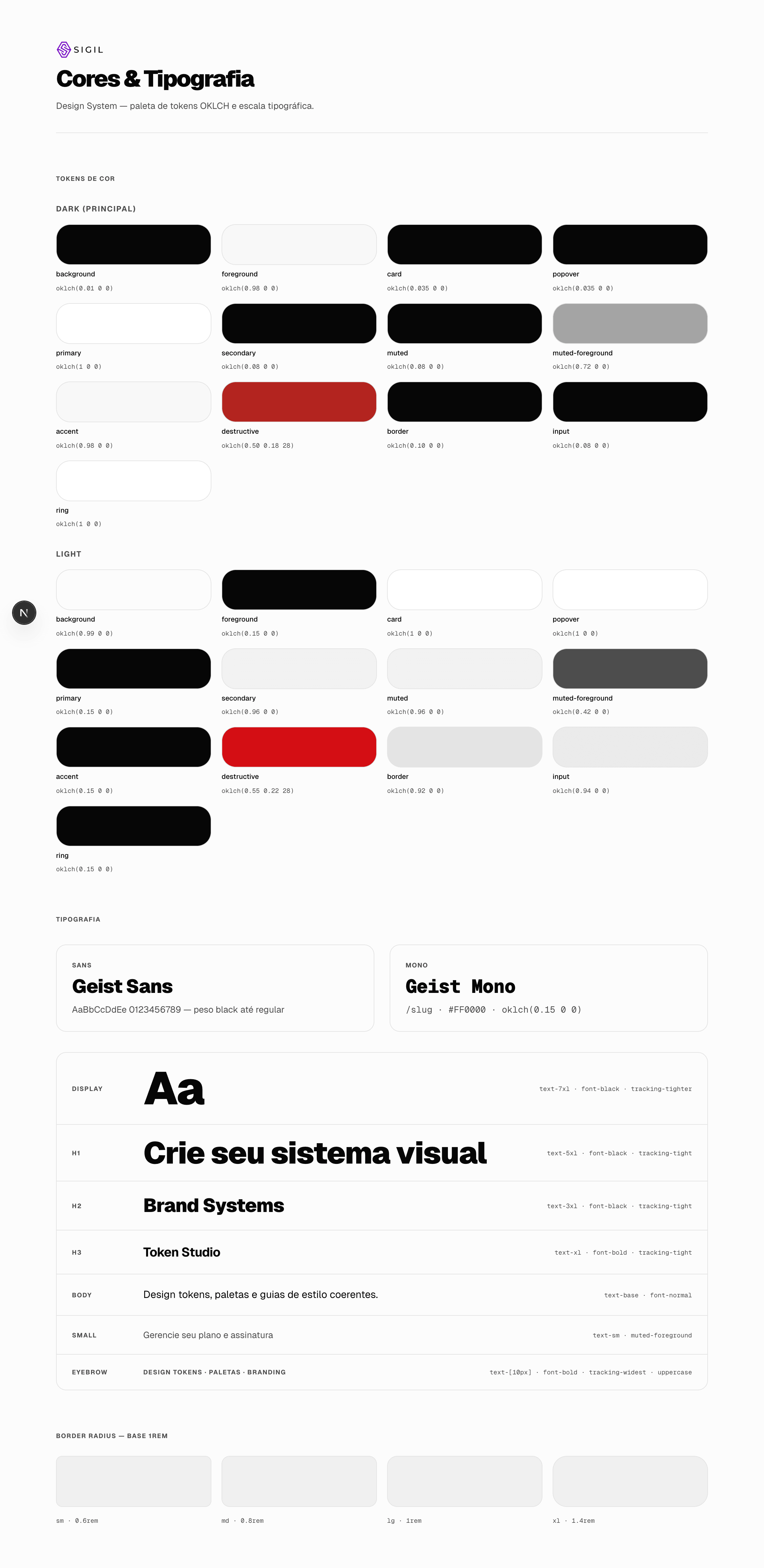
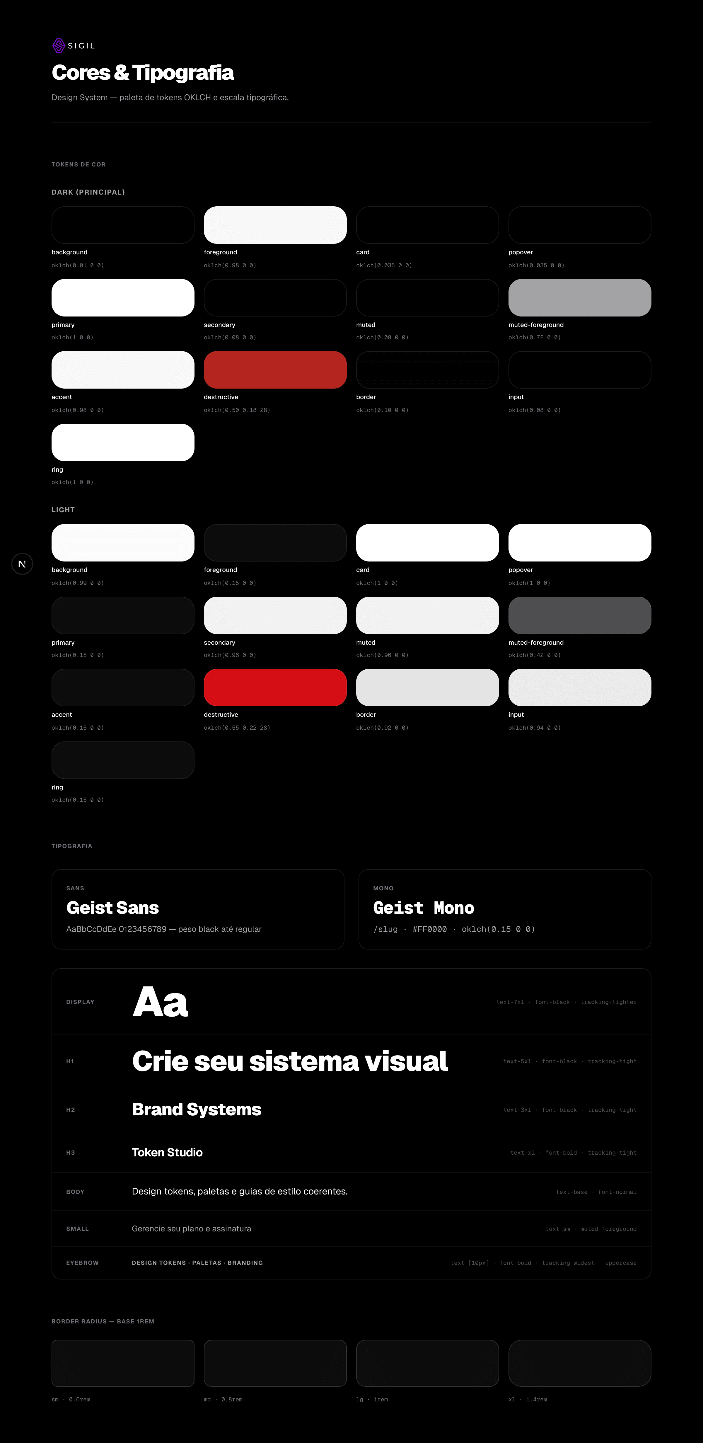
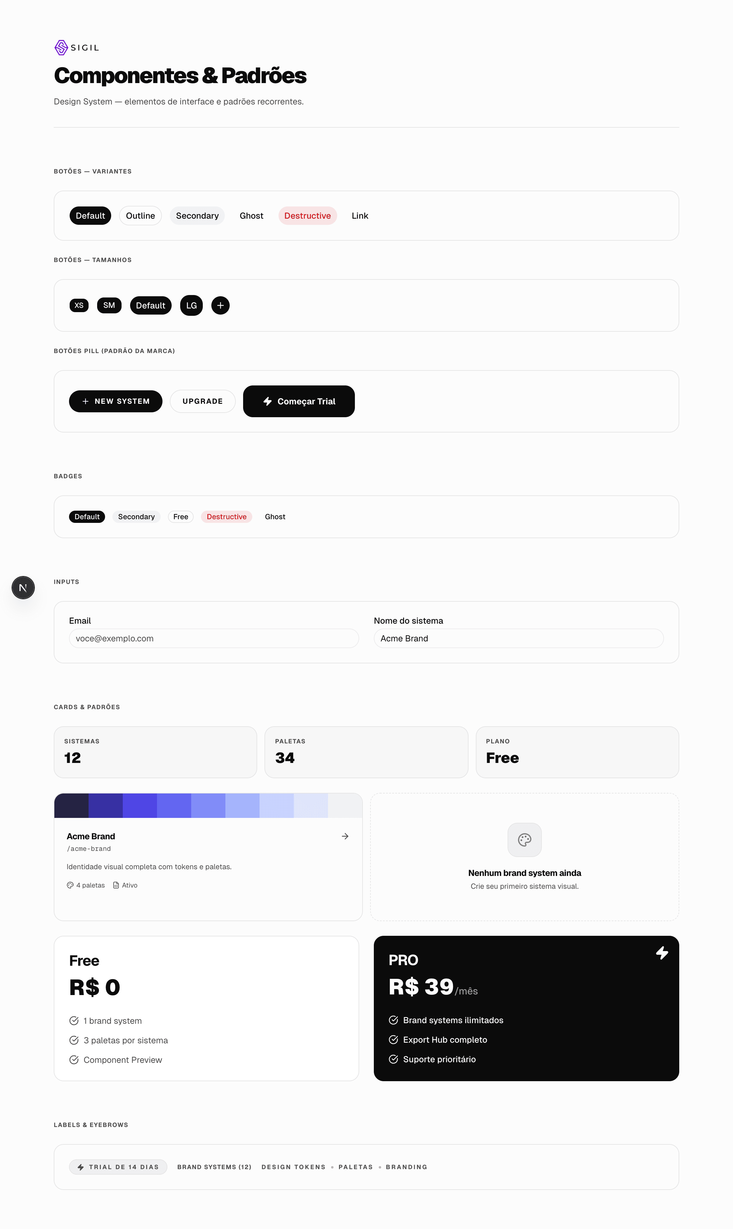
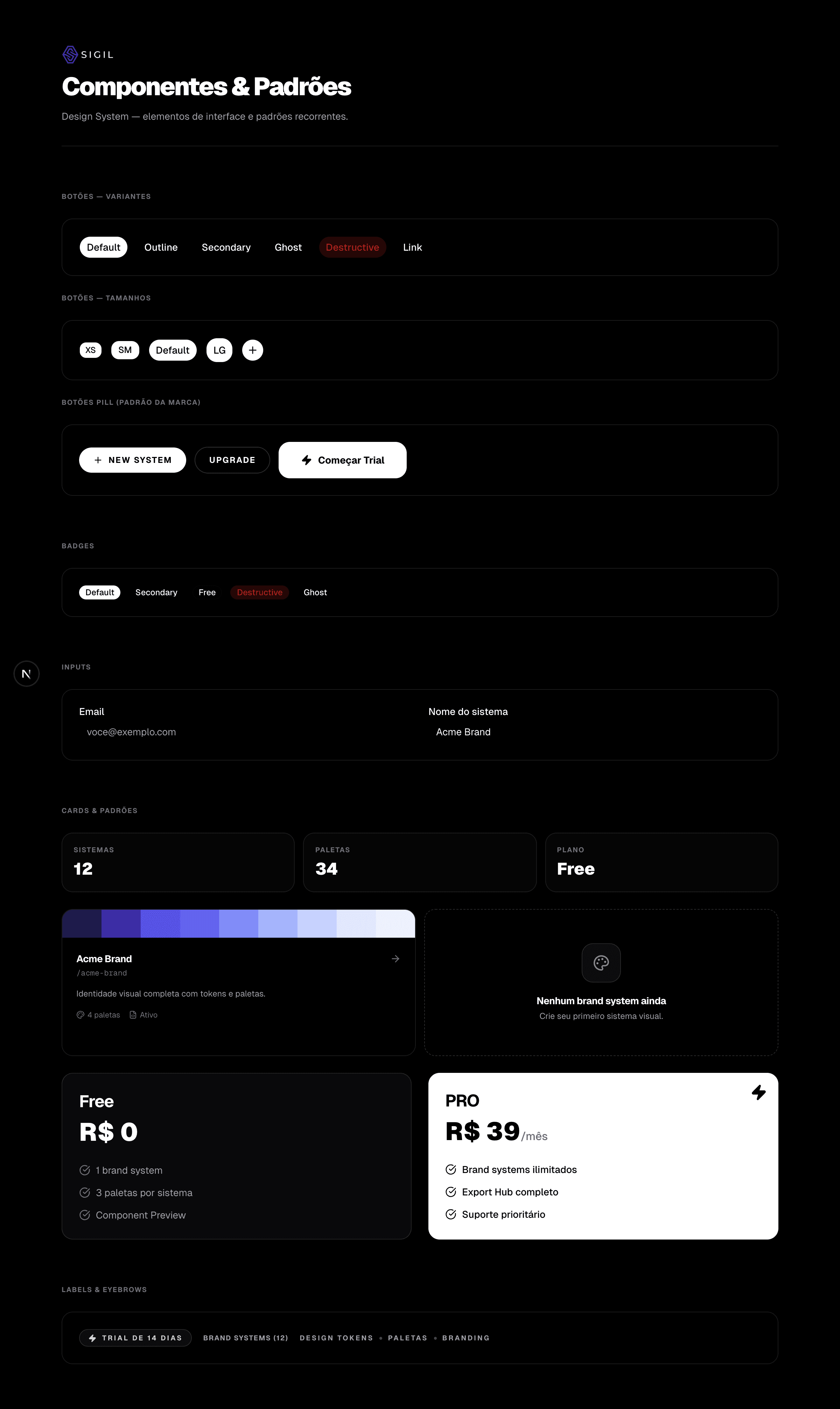
Sigil itself has a design system, and it doubles as living proof of what the tool delivers. The foundation is OKLCH color tokens, with light and dark themes derived from the same source, plus a typographic scale in Geist Sans and Geist Mono spanning from display to supporting text. On top of it live the components: buttons in variants and sizes, badges, inputs, cards and pricing tables, all sharing radii, spacing and states. The result is cross-screen consistency without rework, exactly what the product promises to solo builders.